Ladybirdlist
CONCEPT DESIGN
BRAND DESIGN
NAMING
SOCIAL MEDIA DESIGN
ART DIRECTION
PHOTORAPHY
CONCEPT DESIGN
BRAND DESIGN
NAMING
SOCIAL MEDIA DESIGN
ART DIRECTION
PHOTORAPHY
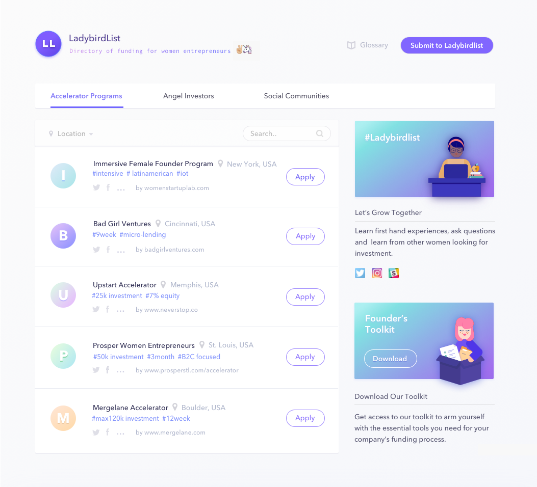
Ladybirdlist is a side project born in 2016 by me and my friend Selin Akcakaya to support women in the tech world. The website is an up-to-date directory of funds, accelerators and network groups that connects women to opportunities via its website, social media channels and internal network. It is a result of investment research we have done over the years to fund our own personal projects.
When we realized that there were many funding opportunities, communities and investor groups focusing solely on female founders around the globe, we decided to share these resources with the rest of the women in tech.
To challenge existing judgements about so-called-girly colors and styles, we’ve purposefully chose pink and violet as our primary brand colors.
We’ve used geometric shapes and smooth movement in order to create a sense of order and balance contrasting our vibrant visual world.

Repetition and Simplicity
Since web logos are used in tiny sizes for favicons and on other small UI details, I kept the logo as simple as possible.
The letter L; made up of two lines intersecting at a 90 degree angle; repeated the initials of Ladybird and List, making a memorible and bullet- proof logo for any web size and distortion.
And finally, we’ve collaborated with our friend Gabriela Ovando from Veni Studio on a video collage piece. Using found footage from online archieves, we touched the themes of female liberation, and empowerment.
If Ladybirdlist rings true for you, remember to follow us on our Instagram page!
If Ladybirdlist rings true for you, remember to follow us on our Instagram page!


Style Guide for Ladybirdlist Website
ALL RIGHTS RESERVED TO ACREB STUDIO, 2024 BARCELONA, SPAIN